Friday, 30 November 2012

7. Getting practical

Here are some practical tests I have been doing in maya.

Ancient Light 

I crated an animated sun using the particle effects in Maya after watching these two tutorial on Gaseous effects.


I want to combine this with other emitters to possibly create and animated 2D image that has the depth of a 3D image. Also could make this one of the final layers of information that are build up on the visualisation of the atom creating a spectacle of - atom - reaction - sun . This would aim to build upon the theory that if you show a base of information it allows you to build on that knowledge imagining the process and applying that on a grander scale.

Here is a render of the sun I made below, and further down is a comparison to real images of the sun. I think to make it more realistic i could add glow effects and add further white into the mix of colours used to create it. I envisage this as a 3D poster on a science corridor, inspiring interest and - combined with the poster concept of ancient light- give fact/ though provoking ideas.


Here is the animation of the sun, I think it works quite well and could look really interesting with more work on it. Also i wondered if the sun made a noise and found out that it resonates and a super low frequency, so I thought it would be good to maybe have that over the top of the animation, as it would give even more interest to the piece.


Monday, 26 November 2012

6. Looking a Bit Sketchy

All of the below sketches can be found in my sketchbook folder for easier reading and refference.
DNA Library
My first idea was to visualise an analogy I read in Richard Dawkins 'The selfish gene' (2006) where he describes the fertilised egg as a bookcase that contained 46 books to represent the chromosomes passed on from he mother and father. 23 were from each parent, and were described in volumes that had different data in them about the parents genetic material. Eg Volume 10 chapter 6 would be on eye colour. I started by laying all the facts out on paper trying to get my head round it all.  

 I then did a quick pain of what I had in mind to add more representation and think about how colour could be used to denote the mothers books /chromosomes and the fathers. I thought that this was a really interesting way of looking at genetics and could create a way to memorise the information. Almost like drawing upon an image to recall the facts.
I used very much the same process when coming up with the next concept where I researched bohr's atomic model to see how it had bee visualised before. Upon doing this i discovered that many of the facts about it were poorly represented as their nature was very vague and hard to visualise clearly. I also started to ponder if I could base my critical framework around graphs and diagrams, versus more visually cinematic displays of the the same information. 
Hydrogen Atom
 I then tried to lay out the information i had gleaned and think of ways i could used to display them in a more true to fact way, and also with a more visually inviting way much like that of the lunar calendar in a previous post.

This is an example of textbook diagrams shown in schools, they leave a lot to the imagination and not in a good way. A more dynamic even interactive creation would make the reationships between the elements and how they move a lot clearer. 

One of the difficulties I encountered was that I myself needed to learn the information to be able to make an attempt at visualising it. So I iterated small diagrams making sure I knew the fundamentals, I have decided to try make this within maya to see if I can make something that can reflect the information i have found on Hydrogen atoms. 

Ancient Light
My final concept that i have been developing is about light and the sun. The basis is that it takes about 10,000 years and 8 minuets for a photon of light to reach the earth from the centre of the sun. I wanted to create a concept that compassed all this information but could also be a stand alone piece like a poster.
I decided to pain a quick lay out with the sun on the left and an eye to represent the viewer on the right.

I lied the idea of a beam of light shooting across the page from the sun to the eye and a timeline below showing that when the photon hitting your retina was made when humans were only just beginning farming and making villages. I wanted to pick a fact that really made the viewer think about it, and realise the time that passes. The photons being made right this second wont reach the earth for another 10,000 years, making every ray of sunshine and light all the more important to people.

As for implementation I thought of making models in maya and crating a digital poster with special effects. 


Friday, 23 November 2012

5. Creation from the Imagination

I have been exploring some of the great collaborations of science and art and uncovering some very interesting things such as below Its an artists impression of a  rhinoceros, is hadn't been seen in Europe for over 1000 years, so Dürer had to work solely from reports that had come from India  He covered the creature's legs with scales and the body with hard, patterned plates.This was maybe to interpret lost sketches, or even the text, some which state that, '[The rhinoceros] has the colour of a speckled tortoise and it is covered with thick scales'.

So convincing was Dürer's fanciful creation that for the next 300 years European illustrators borrowed from his woodcut, even after they had seen living rhinoceroses without plates and scales.This just shows that the visualisation of the creature was so ingrained in the mind of people as to what it looked like, that even when seeing one with their own eyes the old fantastical sketches remained prevalent. The mental images and associations we have are what we base our options and thoughts on, changing someone's view of something can be very hard after they have formed their own opinions .
Above is another sketch done by a different artist, showing just how the idea spread and took off in the days where artists were some of the few who could give people visual material.


Above is a animation that shows all the galaxies that are floating about in a segment of the universe. Its the largest sky map revealed after first public data release from BOSS, the Baryon Oscillation Spectroscopic Survey. Led by Berkeley Lab scientists, the Sloan Digital Sky Survey's BOSS is bigger than all other spectroscopic surveys combined for measuring the universe's large-scale structure.This animated  was made by Miguel Aragon of Johns Hopkins University with Mark Subbarao of the Adler Planetarium and Alex Szalay of Johns Hopkins.
Within it are close to 400,000 galaxies in the animation, with images of the actual galaxies in these positions (or in some cases their near cousins in type). Vast as this slice of the universe seems, its most distant reach is to redshift 0.1, corresponding to roughly 1.3 billion light years from Earth it is only a portion of what is really out there. I find it very inspirational and gives a real visual insight into all thats out there. I also think that for students at highschool or even primary school would find it fascinating and maybe even inspire them to take it up as an interest or hobby. Its thought provoking like this that is missing from the curriculum to capture the imagination and push pupils to explore topics further. With this i started looking into how I could take a concept and visualise it, in the first case i looked to quantum physics such as hydrogen particles, seeing how they were said to behave and how they had been visualised in educational science videos.

Above is one of the videos I looked at that is shown in class rooms, compared to many others it is fairly artisticly done. Some were very simple and condescending for their topics making it very uninteresting to learn  and follow what was going on. I think It could be more visual though, with all the energies going into making films and amazing visual effects, educational resources are really lacking in comparison. 
Im going to aim to have sketches up of some concepts including some on visualising hydrogen atoms to see if I can think of any new or interesting ways to visualise them.


Tuesday, 20 November 2012

Blog silence

Sorry I haven't been blogging recently, I've been really sick for the past two weeks, I will try to catch up as soon as I can.

There is a back log from before I was ill, so I'll get them up asap, however im really worried about the upcoming proposal and reading all the journals... Just got to keep going.

Friday, 2 November 2012

4. The Art Science Effect


Here is another great TED talk very similar to that of David Bolinsky, it details just how we are always giving out data and how we can use all of this to see trends in what we are doing. Giving insightful information about our humanity that Aaron then takes and visually represents to us in a new and engaging way.

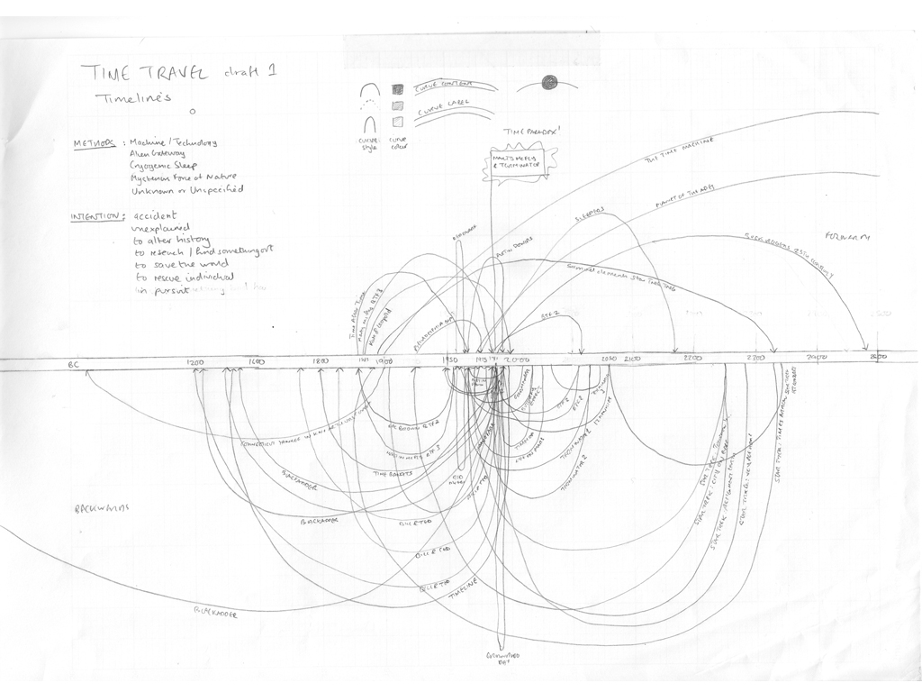
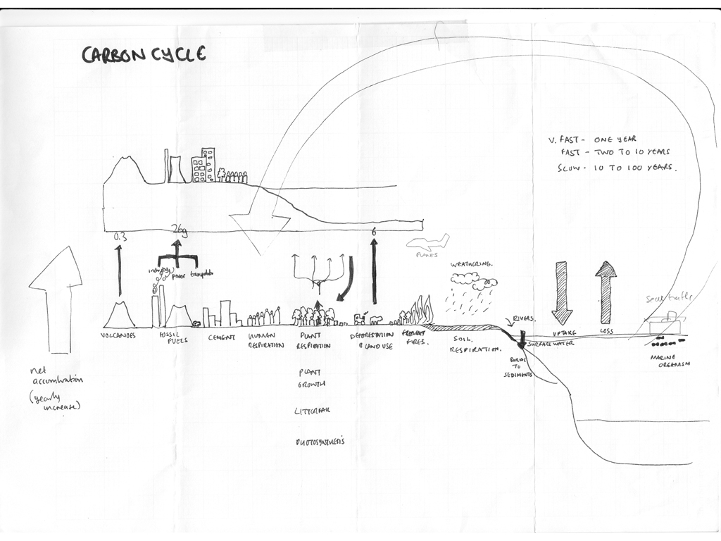
This lead me back to David McCandless' work with infographics, while on his website www.informationisbeautiful.net/ I came across competitions he had been running. One in particular the-napkin-challenge is where sketches of his own work were shown:
Despite being for encouraging people to enter an infographic competition, the simple sketches really took away the anxiety of making my own concepts or at least trying to sketch them out no matter how rough they were. 

I found some of the entry's to the competition really inspiring at well especially this one:


I just thought that as a simple image that looked so craftily done, it had so much data within it thats it could truly be seen as something that could stand alone as being a visually pleasing piece and also be highly functional as a calendar. This dual purpose design is very effective and effient in for more space conscious times.

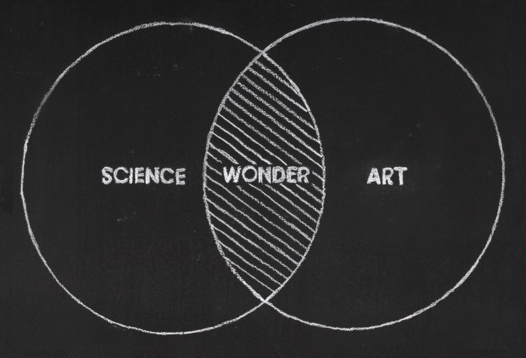
Lastly I found this image, which I very simply surmises David Bolinsky's want to find the magic and wonder that existed around science, but as the mysteries unravel art can step in and try to visualise the real wonder.