Here is another great TED talk very similar to that of David Bolinsky, it details just how we are always giving out data and how we can use all of this to see trends in what we are doing. Giving insightful information about our humanity that Aaron then takes and visually represents to us in a new and engaging way.
This lead me back to David McCandless' work with infographics, while on his website www.informationisbeautiful.net/ I came across competitions he had been running. One in particular the-napkin-challenge is where sketches of his own work were shown:


I just thought that as a simple image that looked so craftily done, it had so much data within it thats it could truly be seen as something that could stand alone as being a visually pleasing piece and also be highly functional as a calendar. This dual purpose design is very effective and effient in for more space conscious times.
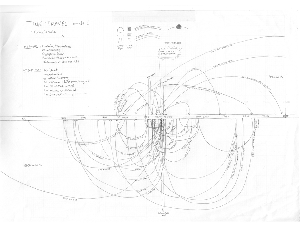
Despite being for encouraging people to enter an infographic competition, the simple sketches really took away the anxiety of making my own concepts or at least trying to sketch them out no matter how rough they were.
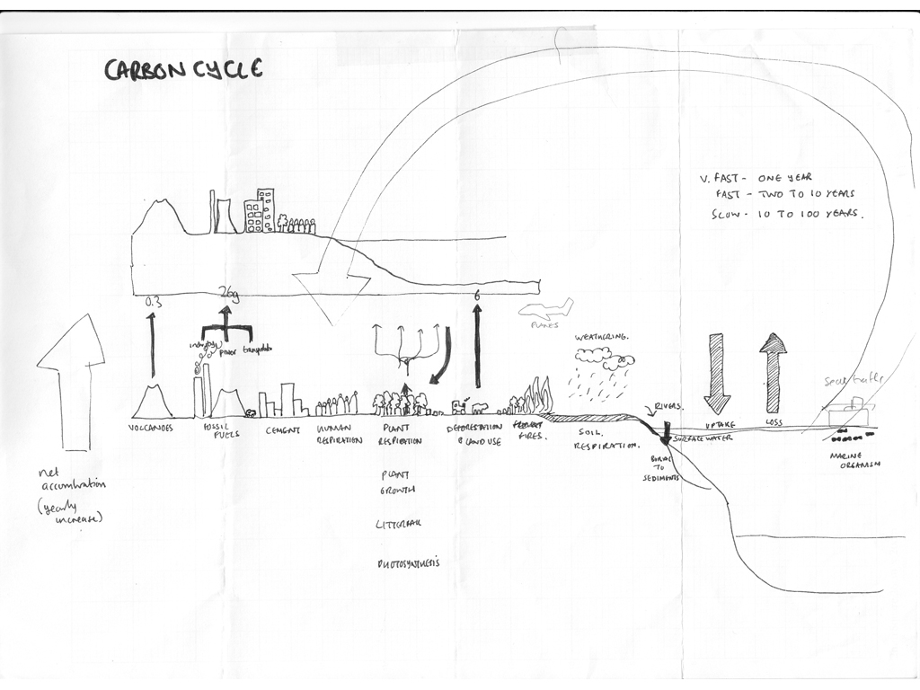
I found some of the entry's to the competition really inspiring at well especially this one:
I just thought that as a simple image that looked so craftily done, it had so much data within it thats it could truly be seen as something that could stand alone as being a visually pleasing piece and also be highly functional as a calendar. This dual purpose design is very effective and effient in for more space conscious times.
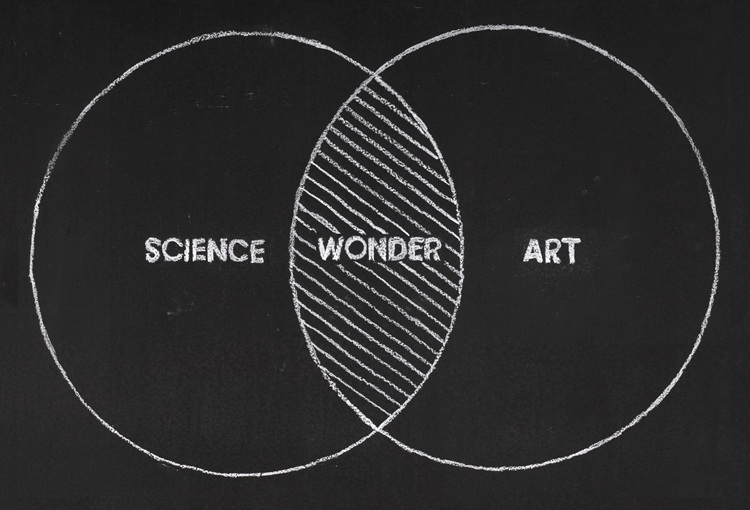
Lastly I found this image, which I very simply surmises David Bolinsky's want to find the magic and wonder that existed around science, but as the mysteries unravel art can step in and try to visualise the real wonder.
No comments:
Post a Comment