Finding a framework is proving very difficult without the guidance of my supervisor due to my extension over the christmas break. Below was my previous thoughts on it, suggesting that if I could find a diagram and then also create the same but more visually, then I could create a set of defining qualities that set them apart. Maybe how the visualisation was more dynamic versus the simple line diagram.
Learning Styles Again: VARKing up the right tree!. Educational Developments
However, I was starting to doubt that it would suffice. So following research and journal reading I have come across the 3 learning styles that were developed by Neil Fleming(2006). He came up with the theory that “The use of learning strategies that are aligned with a modality preferences is also likely to lead to persistence learning tasks, a deeper approach to learning, active and effective meta-cognition ” Meaning that if more visual leanring aids to text based work then it could be very beneficial to the visual learner themselves. This goes hand in hand with the theory created by Kolb that after experiencing classroom experiments or viewing visual stimuli student “create concepts that integrate their observations into logically sounds theories”. These concepts or models could then be tested and built upon leading me to think that this could be a great place to build upon my framework,
The
Lewinian Experiential Learning Model (Kolb 1983)
Here is the diagram adopted by Kolb to describe the process explained above, using this in tandem with how Fleming created the framework to denote a visual learner could really give me something to measure my work against.
The Art of looking sideways is a fantastic book by A. Fletcher the delves in to just about everything. I researched the book endeavouring to find some more abstract material. It has a narrative throughout the book, and initially I did read it from the beginning for the first few 100 pages. I then resorted to using the chapter listing to find the relevant topics. I found a lot of interesting images and thought provoking quotes
The first image that I thought was the one above. The accompanying chapter was on abstraction itself, talking about how there must of been a point in history when a man was sitting next to a fire, and within the flickering flames he sees shapes or shadows that look like a face. It would of been events like these that differentiated us from other animals, the ability to see shapes and build connections though abstract thought. And its what all allows you to see the face in the bag above.
I really liked this image, showing different fonts to represent the scene and where they are placed, not showing any other images other than the table itself..
I like the visual connotations that the words show, conveying their definitions. I think it makes them seamless to their purpose. .
Trying to carve out a general plan for my proposal and how I would like to structure it:
Natural thinking and how we think – more natural to think in imagery vs text > thought process and how we learn thought new connections old data> learning styles visual > could this work? > social/ educational benefit.
Below are quotes and snippets that stood out to me as I found them really inspirational, making me think a lot more about how things are connected or just unseen.
“Thinking is drawing in your head” P 139
“we don’t think in words. The temptation to equate thinking with language is because words are more palpable than thoughts.”
“Logic is the art of thinking and reasoning in strict accordance with the limitations and incapacitates of the human misunderstanding “ - Ambrose Bierce 142
“Imagination forms mental pictures of things not present
Imagination conceives of situations not yet in existence
Imagination conjures up correspondences and analogies” p159
“Unless we can Visualise something then was are unable to think about it” p156
“It has been held that the world is a tangible phenomenon slowly being unravelled by science. An alternative view us that it’s a mirage, a construct of the imagination. A web if ideas, a fabric of our own making” p197
“A picture is a representation or an interpretation. A symbol is the fruit of marriage between the two” p333
“By using one way of saying two things, we can understand the unfamiliar by analogy with the familiar, conveyer the inexpressible by the expressible “ P450 picture play
“ A newly invented metaphor assists through evoking a visual image” p 453 George Orwell
“Art is I… Science is we” Claude Bernard p 12
“Science disembodies, art embodies” John Fowls p 13
On creativity “ a leap across a chasm that is not bridgeable by reason” p 31
“ the Mind thinks with Ideas not information” p 92
Found some good BBC learning videos that were a good reference of what the standard was for animations and abstract visualisation learning. This could be an important reference for curriculum learning as well as the bitesized guides to get a rule of thumb as to what age students are exposed to topics Framwork? This would be invaluable to my demographic study, and thus how it would effect the visual style/ complexity of the topics.
I have also struck gold in my research of journals! After a lot of tracking down I finally paid a small fee and gained a copy of Metaphor and Thought by United States of America: Cambridge University Press. The Chapter "The shift from metaphor to analogy in western science" was especially useful with great insigtits into how the mind processes information.
A Find that has proved very useful as its one of a few sources that has done experiments within the educational system to see if analogical or metaphorical learning aids can help with the absorption of information.
Fun-Analogy Train
The imagery uses concrete images (train cars) were used to represent abstract ideas” (Spezzini, 2010) (see figure 1) therefore by “bridging from the known (train cars) to the unknown (phonological concepts)” I think that despite the lack of high-end visuals the train is a great notion on account of two reasons:
1. The train, is procedural as is speech and its a direct connection
2. the carriages are also directly connected, though not to the degree of the first point.
I feel that there is still coding of information within the image that will need to be remembered and not as natural as a source concept and target concept that have more accessible commonalties.
From this I would like to take the core of the idea, and see if I can create my own concept that has these more natural communicates This could really visually form a solid base for recall of information. If this was proved to be true then it would hold up to the requirements of the framework, in that it would be a highly emotive viusal image with information embedded within it.
Spezzini, S. (2010). Fun-Analogy Train [digital image]. International Journal for the Scholarship of Teaching and Learning. 4 (2), pp. 7.
Following all the research into metaphors and a more abstract aim for my project, I have been unsure that the piratical work and concepts are as relevant as before. I will keep them in mind as I work on my proposal as they may come back into focus as time goes on. Here are some tutorials I have bookmarked as useful depending on the direction of the project.
With the Ancient light concept, I could make it more conceptual, even trying to think about the internal workings of a sun, creating the same concept but in a more abstract manner. Below is a really good atmosphere tutorial that would be useful in creating glow and the right lighting if I did choose to carry on with the sun project.
The below tutorial would be handy for making my atom model more artistic and eye catching, I am still interesting in creating the hydrogen model, I have had some concepts about using flowers as the elements versus the traditional 'solar system' approach.
Elemental Flowers
The concept of using flowers is to represent the elements with a memory based aim. This coincides with some journals that I have sound suggesting that lifelong learning being liked to the mental models we do form when reading and absorbing. Its these abstract visuals that we can call upon to remember how things work or interact with each other. There is some more information in my sketch book.
Th basis is that the petals represnt the electrons and the seeds represent the neutrons and protons
The stability of elements is reflected in how easily the flowers fall apart.
More work is needed on this concept, as I find that is is more coding the information or projecting onto know it rather than finding closer commonalties that link them visually.
The final tutorial that I have found would again be useful for the Ancient light concept, I will leave it here for now untill the direction is more clear, I feel that doing the proposal is turning up new sources and I would like to keep the practical experiments relevant to save on time that is so precious after not being well.
Still trying to get on top of these journals, I have been given an extension so should be able to lock down my proposal and where my project is going. My next worry is how it will effect my practical progress.
This journal is really interesting and exactly what I'm looking for there are sections discussing how " mental models have been outlined as internal representations of concepts and ideas."
This is my main focus, to create something that can be drawn upon when thinking of the topic such as the rough atom animation that I did. These mental models can then be used as memory structures that can be used to "extrapolate beyond a surface understanding of presented information, to build deeper comprehension of a conceptual domain". Also this could tie into freeing up mental capacity mentioned in the previous post, used in tandem could really create a more visual, efficient and long lasting model for the reader. This would be especially helpful in the realms of using visualizations as educational methodologies.
looking into how they create the curriculum could be great for maybe incorporating into a framework?
The Art of Visualisation: Understanding metaphors.
Lynn Baker talks about the tactics frequently employed by teachers
whereby they “employ the use of metaphors to assist students to develop their
understanding, moving from concepts already familiar to them, to unknown areas
and perhaps more abstract concepts”. This can be especially
useful for faster information retention when the target new concept is complex. So in context to my own work, looking into genetics and the elemental table are perfect domains where the concepts are all hidden to the naked eye, meaning the mind needs a reference or model to grapple with the information, creating a foundation to be build upon as you learn more.
Analogy, dialectics and lifelong learning BAILEY T. International Journal of Lifelong Education
I am in the process of reading this but it seems to be on the same train of thought, in that he suggests that complexity of topics plays a big role in how we take them in, the harder and complex the topic - the more necessary a visual aid is
Recently I have been locking down my Key texts for my proposal and trying to find good quotes and notes on what I can gather. The selection is so wide and varied that is can be hard to not get lost in it all and find yourself in a realm of information that is too far from the reality of your topic.
The visualisation chapter of this journal really focuses on the point that by using visualisation in tandem with other inputs such as text, it frees up 'cognitive space' of the working memory. This means that when consulting text or a visual learning aid, your eyes can take in more than decoding everything in text form. For example if you are reading an article and there is an image that represents its core concept, you can consult the image as you read allowing the words to form meaning in your head a lot faster, as you have a rough mental image of it already.
"When readers construct mental images during reading it enables them to form strong links with personal meanings and develop deeper levels of reading engagement"
Following this younger reader will be more active in reading sessions where relevant imagery is used as:
"It follows that children will be more engaged in the reading process when they use visual imagery because it relies on prior experiences to construct mental pictures."
Its all about them building up on what the text and words represent, then they can make connections and observations about what they are reading. This will create a foundation and mental library for them to consult when reading pages that have no images, or speeding up thought processes if there is imagery.
This could be woven into the DNA bunny concept, very watered down genetics, or at least the mental modal for genetics. Would be an interesting topic to challenge the typical demographic age for learning about complex topics.
2 Visualization
Scientific information is spread out over disciplines which, to the outside observer, may seem to have little in common. It is like trying to complete a puzzle and not knowing where to put the piece held in the hand, not seeing which puzzle pieces it fits in with.which is not visible to the eye, or to create a mental image of something that is not obvious (e.g. an abstraction)” (Owen, 1999) is the definition of the word “visualization” that point to the intrinsic need to represent information in a non-traditional manner.
To visualize is a task of the communicative process, through which abstract data and complex phe that
cannot be directly retrieved from a hidden body of knowledge.visible to the human eye that which is small and very difficult to perceive, only exists in our minds, information science resorts to the diffuse realm of
the so-called virtual reality.
Computerized visualization techniques can beused to make manifest phenomena that are not visible on their own, such as the implicit relationships among component elements (Araya, 2003).
What is visualisation? - Lev Manovich
This article is focused on what visualisation is and how it can about, from points, straight lines, curves and simple geometric shapes to stand in for objects and relations between them. It also includes sections on position, size, shape and, movement to convey the differences in information and their relationships. I'm still in the process of reading this journal, but it seems as it would be useful in conveying how and why we see things as they are, and how we build these relationship. All of this in turn could effect how i create my work and how I present it .
A little post! I found this you tube video of the making of DNA very similar to the work of David Bolinski and his visualisation of the cell. After looking a lot into metaphors I realise that even animations like this are metaphorical of what they represent. You could even stretch and say that photographs of people are metaphors and not actual representations, they are only just implicitly said to be someone despite being a piece of photo paper and ink. Its the connections and what they mean to us that form the link to the ideas.
After seeing a lot of visualisations and animations that represent something it occurred to me that they are no more that metaphorical representations of what they stood for. With this in mind I began to look for works that were more abstract and thought provoking, that would take more than a quick look over to understand them
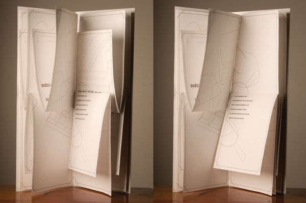
Above is a picture of ‘Chromosome book’ by French student Avril de Perthuis (2011) who metaphorically broke down and visualised natural selection. The book is comprised of many pages that can be arranged in many different possible combinations. Some combinations make the book more readable, but there is only one combination that enables the viewer to read the whole book. This reflects and draws similarities to natural selection in that there are many different possible gene combinations, some are better than others; however there is one that supersedes the rest and is the most effective. I found the piece highly intriguing as it is very interactive and though experimenting with the pages, you become more informed about the process of natural selection and its concept. Interactivity I think is a key area that would grant looking further into, if more than one sense is involved in learning a topic the more information there is connected to it.
Above is a live posters that animate while you are waiting in line, I thought that this was a great example of an animated 'poster' that already existed. I would think that they would be the next big thing, with corridors in school lined with different ones. If i was to develop the Ancient light project or even the hydrogen atom project then either could be used as digital posters.
It has also lead me to think about interactivity in a tactile sense - I recently had a meeting with two specialists at the university, Adam Sampson who was coding based, and James Bown who focused on the visualisation side of things. They were currently creating a system to represent and visualise how cells and chemicals would be affected by different kinds of cancer treatment, as well as past works where they would break down biological hierarchy's and make codded models of how they interact with each other. I initially had a meeting with Adam where he showed me the models of he was working on and how they could be programmed to show different behaviours and reactions. I found this really interesting as I could see the benefits of making it and how it could be used to map behaviour of a lot of things from bird flocks to bacteria. The viewer could then see how they would react in certain situations visually, enabling them to try and predict outcomes/ make observations.
Following this I had a meeting with James Bown where he showed me a recent presentation on the work he was doing on the cancer research and visualisation. It was very insightful for me to see how they were using the models they had made of cell hierarchy and how the cancer effected them, and then incorporated that into visualisation of the whole process. You could then take one chain of the cell, add a chemical reaction and see what effect it had on the cancer and the rest of the chain of command. Highly complicated stuff, but with the use of the visualisation and the body's capability of taking in so much visually it was a lot easier to take in than it would of been if it were text based.
Jonathan Harris' magical new media projects redefine storytelling from PopTech on Vimeo.
I saw this video the other day, and it made me think of the connections we have between everything, from people to objects and memories. Made me think about my work and the works of other being more like bridges to get people to connect A with B.
Another artist who strives to do the same is Ronald Forbes creates abstract artwork bringing together different aspects of some ideas and merging them with others. His work seems very poetic and metaphorical bringing mostly science and art together in abstract manners that challenge us to see where one begins and he other ends. Some images have collages of different images to define microbes or scientific ideas, yet the imagery is almost nonsensical at first glance with layer of meaning and literal layers in the paining. I want to maybe corporates more abstract models into my own work.
Ronald Forbes
I have had some ideas of abstract ways to visualise some scientific topics these include:
Elemental Flowers
looking at how i could relate the elements to different types of flowers, with petals denoting their electron number and seeds to represent their protons/neutrons
Pair of Chromosome Hares
While looking at different scientific concepts on genetics i came across a picture of Chromosomes
After a long day working I squinted at the picture and thought that they looked very much like bunny ears, so I started thinking about if you could create a concept to teach younger children about genetics using simple Bunny or Hare metaphors . This would challenge normal constraints of age demographics and when you would be taught genetics. It may be too much abstraction for very young children, but could merit looking into.
Following experiments with the particle emitter in Maya I decided to see if I could create a shell or electron field that was more reflective of its ambiguous nature of it not existing at any specific point.
These were some experiments where i was altering the diffusion and spread of the gas and creating hollows in the middle for the quarks.
Instead i decided to go with a shader, and after a few tests decided to go with the one on the bottom right with a grey mist like feeling around the edges, and hollow middle. I thought that it would give a orb like feeling at the same time as giving a sense of cloudiness near the edges.
I also did experiments with the connection editor using it to animate the colour or the orbs depending on their positions so that the colour of the animation would be more dynamic changing as you moved it around the axis's.
Above are the first two renders of the models, the coloured materials inside are made out of animated 3D particle effects giving them a swirling motion representing the mysterious quarks inside any atom.
Above is the first animation I did showing the glowing quarks and the shader orb, i created motion paths for the 3D emitters to follow and set the animations to repeatedly follow that. This was to represent how the quarks interact with each other, the next level would be them exchanging colours perhaps related to where they were on their motion path. I wanted to slow it down a bit and get rid of the jitter as it seemed to erratic.
Here is the final animation for now, much smoother than before. I also added a representative photon that flies in from the top right passing thought the electron layer and exciting it to another level, which then drops back down to its base line after a duration. This in real life would create an emission of a photon, which if continued i will add in later.
All of these animations are proof of theory and aim to get a basic model in there to work upon. I would like to see what my lecturers thing and then take it from there following crit.
This Crit post has been long long overdue with notes on my feedback resting in my notebook. Overall I think I got good feedback on my progress, after all my meeting with the scientists and really focusing on practical work after comments in Pitch.
Some key point were to explore more abstract idea and to get more of my artistic stamp on the practical work. I think this is a fair point as my practical work was mostly test done in maya as proof of concept and to know that I could do it. However, I think there is a lot to say artistically about how people see imagery and form connections to other things. I would like to explore this more as I have seen it cropping up in work I find. I would like to try to stay loyal to a practical based project, founded on education and learning vs a more exploratory art endeavour, though I'm not opposed to elements of this in my work.
So to summarise I will be looking more into HOW we see things and form connection and HOW the use of metaphor can make things easier to understand, and if it is applicable visually. My main focus these next few week will be to get my proposal materials all rounded up such as key texts etc.
Here are some practical tests I have been doing in maya.
Ancient Light
I crated an animated sun using the particle effects in Maya after watching these two tutorial on Gaseous effects.
I want to combine this with other emitters to possibly create and animated 2D image that has the depth of a 3D image. Also could make this one of the final layers of information that are build up on the visualisation of the atom creating a spectacle of - atom - reaction - sun . This would aim to build upon the theory that if you show a base of information it allows you to build on that knowledge imagining the process and applying that on a grander scale.
Here is a render of the sun I made below, and further down is a comparison to real images of the sun. I think to make it more realistic i could add glow effects and add further white into the mix of colours used to create it. I envisage this as a 3D poster on a science corridor, inspiring interest and - combined with the poster concept of ancient light- give fact/ though provoking ideas.
Here is the animation of the sun, I think it works quite well and could look really interesting with more work on it. Also i wondered if the sun made a noise and found out that it resonates and a super low frequency, so I thought it would be good to maybe have that over the top of the animation, as it would give even more interest to the piece.
All of the below sketches can be found in my sketchbook folder for easier reading and refference.
DNA Library
My first idea was to visualise an analogy I read in Richard Dawkins 'The selfish gene' (2006) where he describes the fertilised egg as a bookcase that contained 46 books to represent the chromosomes passed on from he mother and father. 23 were from each parent, and were described in volumes that had different data in them about the parents genetic material. Eg Volume 10 chapter 6 would be on eye colour. I started by laying all the facts out on paper trying to get my head round it all.
I then did a quick pain of what I had in mind to add more representation and think about how colour could be used to denote the mothers books /chromosomes and the fathers. I thought that this was a really interesting way of looking at genetics and could create a way to memorise the information. Almost like drawing upon an image to recall the facts.
I used very much the same process when coming up with the next concept where I researched bohr's atomic model to see how it had bee visualised before. Upon doing this i discovered that many of the facts about it were poorly represented as their nature was very vague and hard to visualise clearly. I also started to ponder if I could base my critical framework around graphs and diagrams, versus more visually cinematic displays of the the same information.
Hydrogen Atom
I then tried to lay out the information i had gleaned and think of ways i could used to display them in a more true to fact way, and also with a more visually inviting way much like that of the lunar calendar in a previous post.
This is an example of textbook diagrams shown in schools, they leave a lot to the imagination and not in a good way. A more dynamic even interactive creation would make the reationships between the elements and how they move a lot clearer.
One of the difficulties I encountered was that I myself needed to learn the information to be able to make an attempt at visualising it. So I iterated small diagrams making sure I knew the fundamentals, I have decided to try make this within maya to see if I can make something that can reflect the information i have found on Hydrogen atoms.
Ancient Light
My final concept that i have been developing is about light and the sun. The basis is that it takes about 10,000 years and 8 minuets for a photon of light to reach the earth from the centre of the sun. I wanted to create a concept that compassed all this information but could also be a stand alone piece like a poster.
I decided to pain a quick lay out with the sun on the left and an eye to represent the viewer on the right.
I lied the idea of a beam of light shooting across the page from the sun to the eye and a timeline below showing that when the photon hitting your retina was made when humans were only just beginning farming and making villages. I wanted to pick a fact that really made the viewer think about it, and realise the time that passes. The photons being made right this second wont reach the earth for another 10,000 years, making every ray of sunshine and light all the more important to people.
As for implementation I thought of making models in maya and crating a digital poster with special effects.
I have been exploring some of the great collaborations of science and art and uncovering some very interesting things such as below Its an artists impression of a rhinoceros, is hadn't been seen in Europe for over 1000 years, so Dürer had to work solely from reports that had come from India He covered the creature's legs with scales and the body with hard, patterned plates.This was maybe to interpret lost sketches, or even the text, some which state that, '[The rhinoceros] has the colour of a speckled tortoise and it is covered with thick scales'.
So convincing was Dürer's fanciful creation that for the next 300 years European illustrators borrowed from his woodcut, even after they had seen living rhinoceroses without plates and scales.This just shows that the visualisation of the creature was so ingrained in the mind of people as to what it looked like, that even when seeing one with their own eyes the old fantastical sketches remained prevalent. The mental images and associations we have are what we base our options and thoughts on, changing someone's view of something can be very hard after they have formed their own opinions .
Above is another sketch done by a different artist, showing just how the idea spread and took off in the days where artists were some of the few who could give people visual material.
Above is a animation that shows all the galaxies that are floating about in a segment of the universe. Its the largest sky map revealed after first public data release from BOSS, the Baryon Oscillation Spectroscopic Survey. Led by Berkeley Lab scientists, the Sloan Digital Sky Survey's BOSS is bigger than all other spectroscopic surveys combined for measuring the universe's large-scale structure.This animated was made by Miguel Aragon of Johns Hopkins University with Mark Subbarao of the Adler Planetarium and Alex Szalay of Johns Hopkins.
Within it are close to 400,000 galaxies in the animation, with images of the actual galaxies in these positions (or in some cases their near cousins in type). Vast as this slice of the universe seems, its most distant reach is to redshift 0.1, corresponding to roughly 1.3 billion light years from Earth it is only a portion of what is really out there. I find it very inspirational and gives a real visual insight into all thats out there. I also think that for students at highschool or even primary school would find it fascinating and maybe even inspire them to take it up as an interest or hobby. Its thought provoking like this that is missing from the curriculum to capture the imagination and push pupils to explore topics further. With this i started looking into how I could take a concept and visualise it, in the first case i looked to quantum physics such as hydrogen particles, seeing how they were said to behave and how they had been visualised in educational science videos.
Above is one of the videos I looked at that is shown in class rooms, compared to many others it is fairly artisticly done. Some were very simple and condescending for their topics making it very uninteresting to learn and follow what was going on. I think It could be more visual though, with all the energies going into making films and amazing visual effects, educational resources are really lacking in comparison.
Im going to aim to have sketches up of some concepts including some on visualising hydrogen atoms to see if I can think of any new or interesting ways to visualise them.
Sorry I haven't been blogging recently, I've been really sick for the past two weeks, I will try to catch up as soon as I can.
There is a back log from before I was ill, so I'll get them up asap, however im really worried about the upcoming proposal and reading all the journals... Just got to keep going.
Here is another great TED talk very similar to that of David Bolinsky, it details just how we are always giving out data and how we can use all of this to see trends in what we are doing. Giving insightful information about our humanity that Aaron then takes and visually represents to us in a new and engaging way.
This lead me back to David McCandless' work with infographics, while on his website www.informationisbeautiful.net/ I came across competitions he had been running. One in particular the-napkin-challenge is where sketches of his own work were shown:
Despite being for encouraging people to enter an infographic competition, the simple sketches really took away the anxiety of making my own concepts or at least trying to sketch them out no matter how rough they were.
I found some of the entry's to the competition really inspiring at well especially this one:
I just thought that as a simple image that looked so craftily done, it had so much data within it thats it could truly be seen as something that could stand alone as being a visually pleasing piece and also be highly functional as a calendar. This dual purpose design is very effective and effient in for more space conscious times.
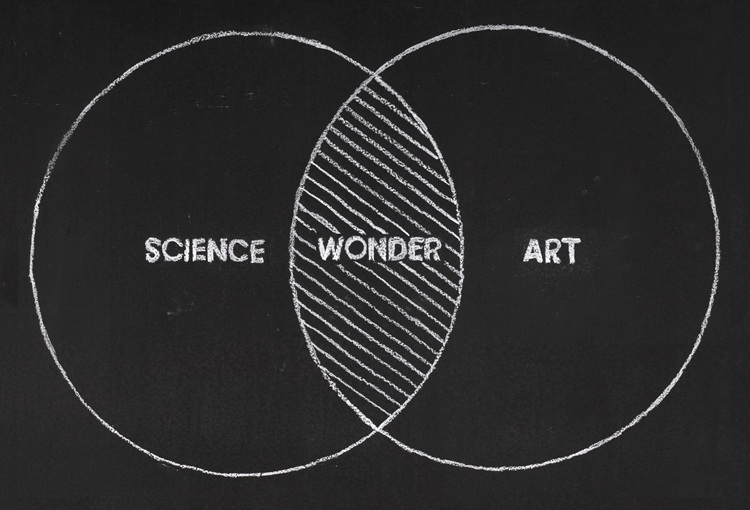
Lastly I found this image, which I very simply surmises David Bolinsky's want to find the magic and wonder that existed around science, but as the mysteries unravel art can step in and try to visualise the real wonder.
I know that I would like to hold learning and education close to the heart of my idea though the project.. As in high-school I really struggled to take in information, always lagging behind or needing a bit more time. It was then discovered that I was very dyslexic and just needed to learn in a more visual way. Once I knew this I began to excel in my subjects. This has inspired me in my 4th year to see if I can explore other ways of looking at information, making them more visual and potentially easier to understand. David McCandless is a perfect example of someone with the same goal, and after watching the anatomy of a virus and reading Information is Beautiful I decided to research him a bit more and see if it inspired exploration into any new realms.
In the talk he passionately speaks about how binding together the inputs of the senses and mind creating new relationships to the information. He draws beautiful conclusions from complex datasets -- thus revealing unexpected insights into our world though his visual work.
This TED talk by David Bolinsky is about how by connecting art and science it can make things more magical and bring back the wonder of what happens inside us. He and his team create animations of the smallest factories inside our bodies, cells. While working with scientists to retain credible designs and models, the is also room given so the visa can still be observed.“Explore the truth and Beauty inherent in molecular and cellular biology so that Students could understand a larger picture, that they could hang all these facts on“ – David Bolinsky. I want to see if I can also do the same and maybe create some art or animation inspired by science thats helpful or inspires people to look at subjects in more detail.
To the right is a motion-graphic based on tsunamis, where the imagery enhances and enforces the narrative of the story sparking the imagination of those watching. I like the idea of the images reflecting the narrative, and being intertwined with the learning of tsunamis. Makes for a more visually engaging process that could enrich how we recall the information.
(Physicsworld.com)
Above is a visual representation of what a photon looks like. I have been looking into how science is translated from concepts into visual material to better denote whats happening.
I think art like this is very valuable and can serve as a learning aid, opening up a new way of thinking about the facts. I would like to explore more visuals or pieces of work that have a similar focus.
Following the first thread of the thought process of visualising I read though, or rather looked though 'Information is Beautiful' by David McCandless. The whole book is filed with inspired designs that really make you think about the context and try to put the information into context
The collection of data that was so seamlessly communicated to the viewer in a new or interesting way. I especially like the one below displaying the different content of well known coffees. While this may seem trivial its something that the majority of us drink, yet few of us actually know. This was what intrigued me the most, things that are constantly in our life but we almost take them for granted or don't pay much attention to. The simplistic nature makes it accessible for anyone and instantly visually informative, there is almost no imagining of how much of something is in another cup, its all in context with little effort needed.
The snake oil infographic below is useful and interactive. You can peruse just for insight or find the vitamin or mineral that your take and see how it compare on the scale. According to McCandless himself it was very time consuming to source all the data and then compile it so it could be deigned and viewed in this manner.
Had my Pitch and good some good feedback and some constructive criticism! After talking about how I was looking in to Albert Einstein used his thought processes to build up concepts, I was to look more into the workings of Leonardo Da Vinci and how he came up with his ideas. I was also told to look into the founder of Infographics Edward Tufte who was one of the founder of the movement and data visualisation.
More practical research was my next step, and to be realising some of my ideas. Also a big topic was age demographic and how it would effect the experiments, which i think is a really good point and will be sure to look into later. Going to consider how the demographic feeds into how complex the idea can be that will in turn also effect the visual style of the concepts.
I also had Piches from the 1st - 3rd years and found all of their work very inspiring. Some of them have really good ideas such as that of Alex Grahame. I really liked some of her expressive models for the group work on lord of the flies. Inspired by byroglyphics it is used to illustrate the story of the character through explosions from their heads to also show the scene in a dynamic way. On the other hand representing bursts of emotion at the moment when people die in the story, its also symbolic of the blood and gore during the same scene reflecting its loud graphic nature.
I have been working in my ever-note from the beginning but have decided to transfer it all over to blogger to make it more accessible. So some of the post will be summaries of work i have researched or work I have done.
So, during the early stages of my project I wasn't entirely sure what I wanted to do, however, what I did know was that I wanted to include themes of Education and Learning.
Initially wanting to try and visualise a power-point
that teaches all about the creation of oil and gas I made an appointment with my lecturer to discuss my project. At this stage Lynn asked why I wanted to do it and if it really interested me, she also gave me a book called 'Information is Beautiful' by David McCandless and showed me this video on infographics by Patrick Clair
The video inspired me to look at HOW to communicate information, and lots of it. The Infographic video uses slick animations to illustrate and Visualise the information in a way that is more manageable and accessible for the viewer. The images used also emphasise the words of the narrator by drawing upon associations and sights that help to connect or quantify the information in real world terms.
For example it relates the virus Stuxnet to be a weapon, and at the same time enforces this visually by showing a picture of a gun, then paining out to reveal the word CODE made images of guns. This conveys many visual messages that back up the narration, the viewer will then connect that - Stuxnet is a weapon like a gun - it is equivalent to lots of guns - it is made of only code.
I would like to delve into infographics more and see how other complex thoughts or data can be conveyed in an effective visual way. I will also read though the book given to me be my lecturer for inspiration and ideas.